The thrilling conclusion to Josie Schuller’s clash with her life as a housewife and her secret life as an assassin. Though perhaps not a new concept, this old setting breathes new life into the idea of a woman leading a double life. The setting has such hope, with its cutting edge technology and the feel of being on the road to greatness. It certainly mirrors Josie as she uses her talents to truly take charge of her life.
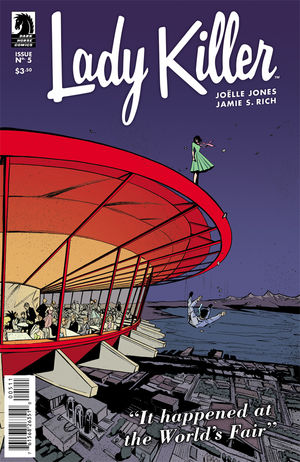
This issue, #5, takes place at the Seattle World’s Fair. It opens with a lovely throwback to the ’50s with a black and white infomercial. Joelle Jones does a wonderful job of capturing that vintage charm. It really makes her modern style stand out all the more without looking totally at odds. Despite the style being far more updated than the setting, Jones meshes the two beautifully. I also particularly loved her random ink splatters and even some fingerprints. Normally, pages that I’d refer to as “dirty” are a major pet peeve of mine. However, Jones blends it in so seamlessly with the rest of the art that it looks perfectly natural. One minute, it works as texture on the wall. The next, it’s blood splatter coming off the panel. Furthermore, it gives the art a gritty realism. Josie’s life is definitely messy right now, so the visual of her narrative reflects that. Truly brilliant.
Storywise, this issue stands just as strong as its art. I love the title, which flips the term for a man who successfully woos many women, and makes it literal. The switches don’t stop there though. So much is turned on its head throughout this story. It kept me excited through my read. In fact, I really felt this issue was far too short simply because I was speedreading to see where Josie would end up. Joelle Jones and Jamie S. Rich prove a strong team, though I’m looking forward to seeing how Jones carries on by herself in the future.
Laura Allred’s colors pair beautifully to really tie the whole issue together. She’s got bright pops of color that the era was known for that really keep the characters in focus. The violent red during the fight scenes gives them that pulp feel. That red really come into play in the most shocking death, which gives it an extra emotional kick. Nothing feels stale, despite the vintage setting that the pulp genre is known for. This art team really manages to keep everything so fresh and interesting.
Finally, Crank!’s letters work just as they should, hardly noticable. Everything is clear and the sound effects are fun without being dominating, letting the action speak mostly for itself. I especially liked the end caption, which captured the typical sign off font of ’50s television. A nice little nod.
In short, I highly recommend. Despite not being a fan of this particular genre, I found myself in love with this story and its art. I really look forward to seeing what Jones has in store for fans, and I know everyone will feel the same if they read this issue, let alone the series!
Comments are closed.