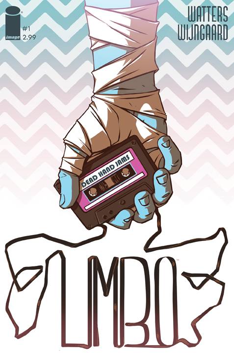
Forget everything you think you know about noir. Forget the P.I., the dame, the crime boss, the gritty city they’re all stuck in… except don’t. Limbo takes all those tropes and throws them in a blender with some neon lights and 80s music. The result is one hell of a comic that everyone should be reading.
 Limbo follows Clay, a man with amnesia who turns to private investigation to get by as well as help in piecing together beyond the mere nine months he remembers. Naturally, Clay takes on a case for Bridgette, who’s “alright, if you’re into the whole ‘voice-of-an-angel, body-of-a-goddess’ sort of vibe.” While Bridgette knows she works for the local kingpin, she tried to keep out of the nastier side of her bar’s business. That is until she’s witness to something that makes Poltergeist look like a kiddy show, so she turns to Clay for protection.
Now, I am by no means a noir buff. I certainly recognize some of the more obvious elements though. Even with my limited noir experience, Dan Watters makes me feel right at home in Limbo. He has a very relaxed way of writing through Clay’s narrative that makes everything flow beautifully, even when the scene has some table-smashing action. His writing also has a tongue in cheek element that had me quietly chuckling to myself throughout the read. I mean, come on, literally the first line is “Lizard on a stick.” This clearly isn’t a straight up crime drama and I love it for that.
In fact, I think Limbo embodies my personal favorite form of humor. I like my comedy to have a good dose of intelligence about it. Limbo disassembles noir and kind of pokes fun of it in a sort of loving way. Sure, a lot of Clay’s witty one-liners are a bit obvious. I like his no bullshit take on his surroundings though. It’s a raw and honest sort of humor. But there’s definitely a more subtle undertone in the way the genre itself is subverted. That blending of different types of humor really mirrors the overall blending of elements throughout this issue.
Meanwhile, Caspar Wijngaard plays a very large role in the tone of this series. He does such an amazing job of mashing together inky shadows with obnoxiously bright neon colors. It’s through his artwork that Limbo really grabs me by the throat and drags me into Dedande City. For example, when you think creepy voodoo, you definitely don’t think of pink and purple as complementary colors, but with those heavy shadows, it’s terrifying and electric. It creates such a raw mood that it’s impossible not to get completely sucked in.
Finally, Jim Campbell on letters is the final touch in this great issue. I’ll admit that I am more than a little biased, because I’ve had the pleasure of working with Jim. I’m a big fan of his clean style. That said, he’s got some very creepy font in here that show his full range. He goes great lengths to ensure that his lettering is complimentary to each character or effect and absolutely never intrudes upon the art. Jim’s lettering blends seamlessly with the artwork and is a testament to the fact that lettering is absolutely its own art form.
I definitely recommend Limbo, regardless of what your preferred genre is. My only stipulation is that this is a mature comic, so obviously not one for little ears (or eyes in this case). The blending of so many various elements could have easily been chaotic, but this is masterfully done and is a smooth read. Both story and art are key in exploring that and they do a wonderful job. If you’re looking for a laugh and a whole bunch of other stuff, make sure you grab a copy.
Comments are closed.